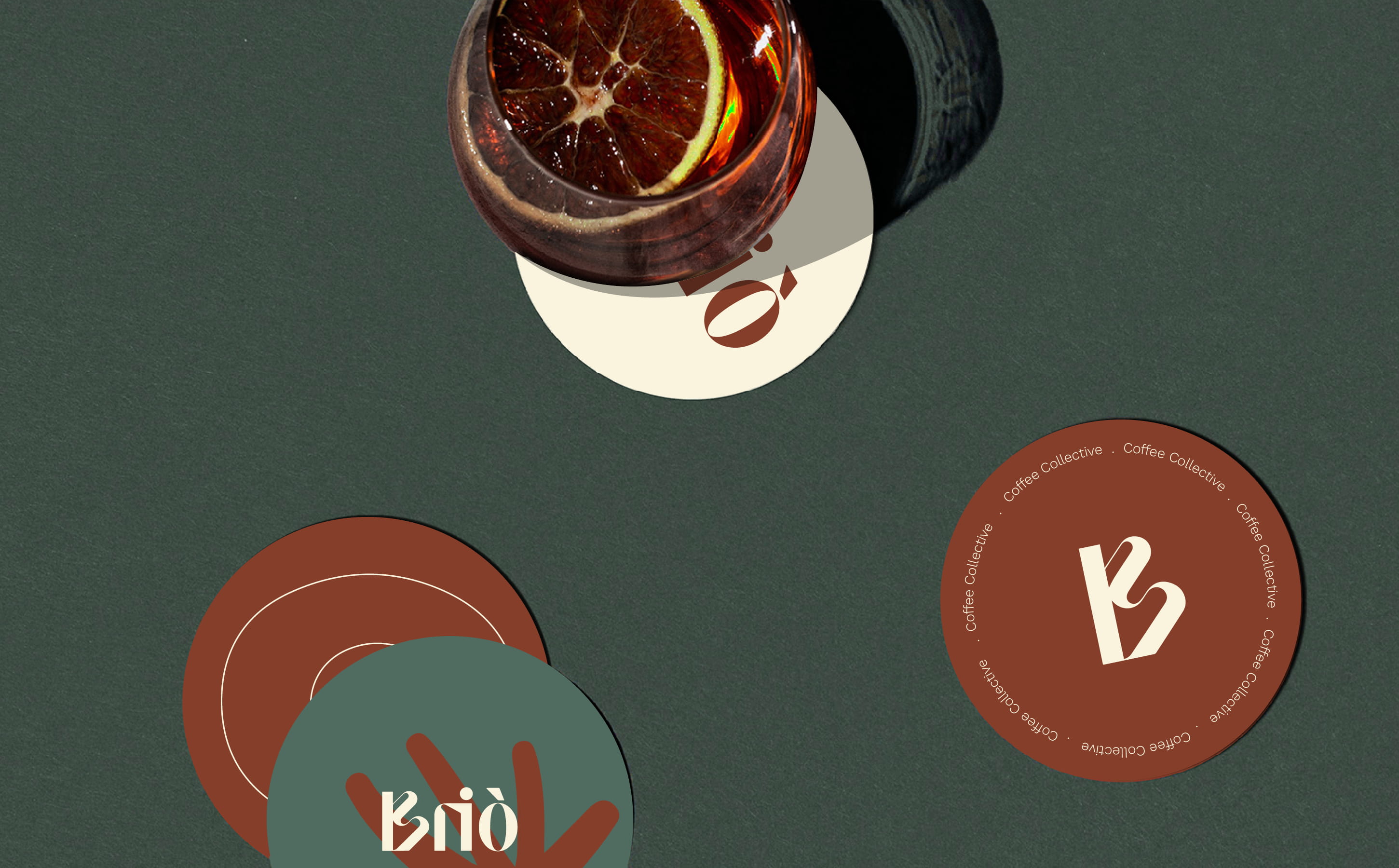
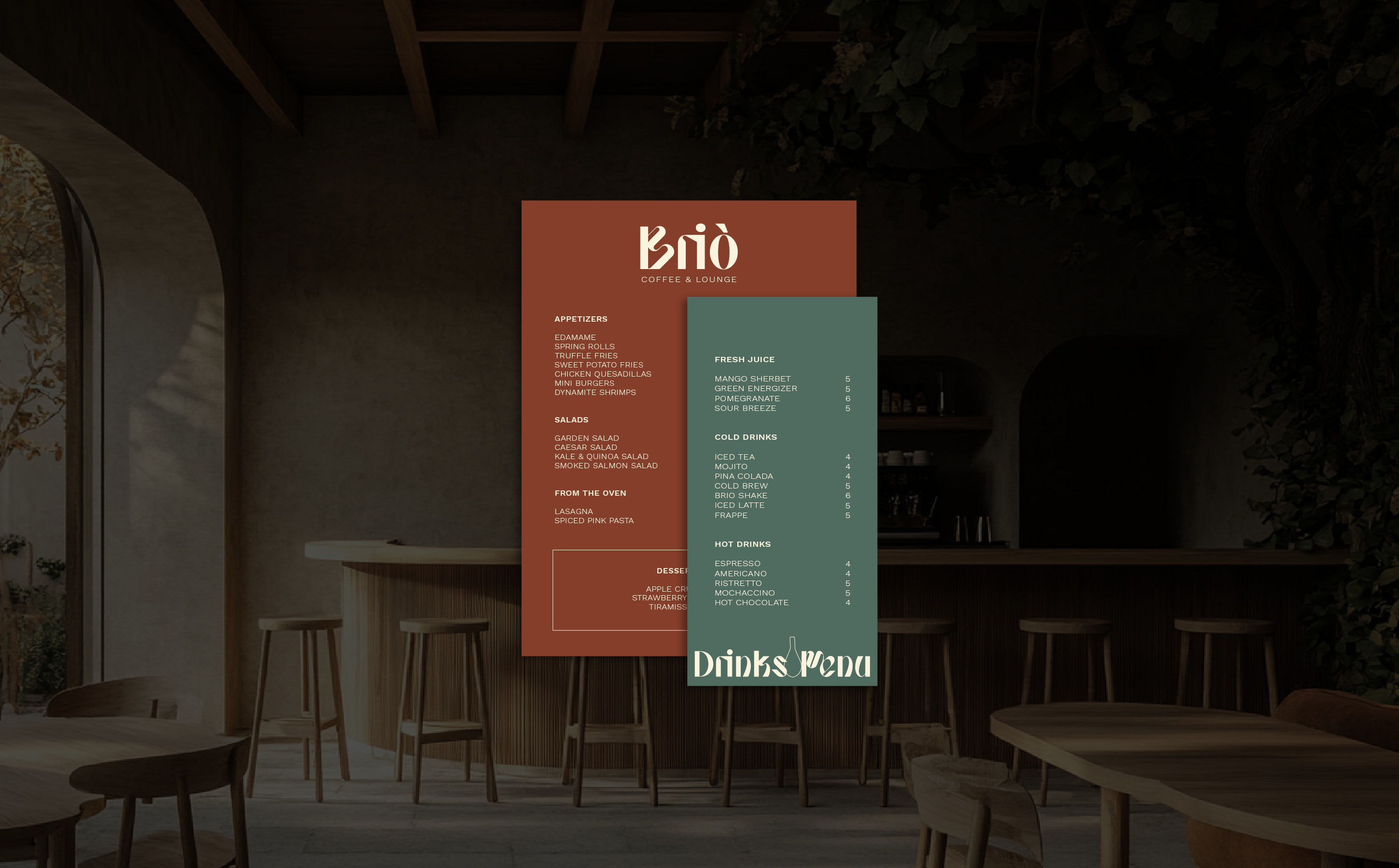
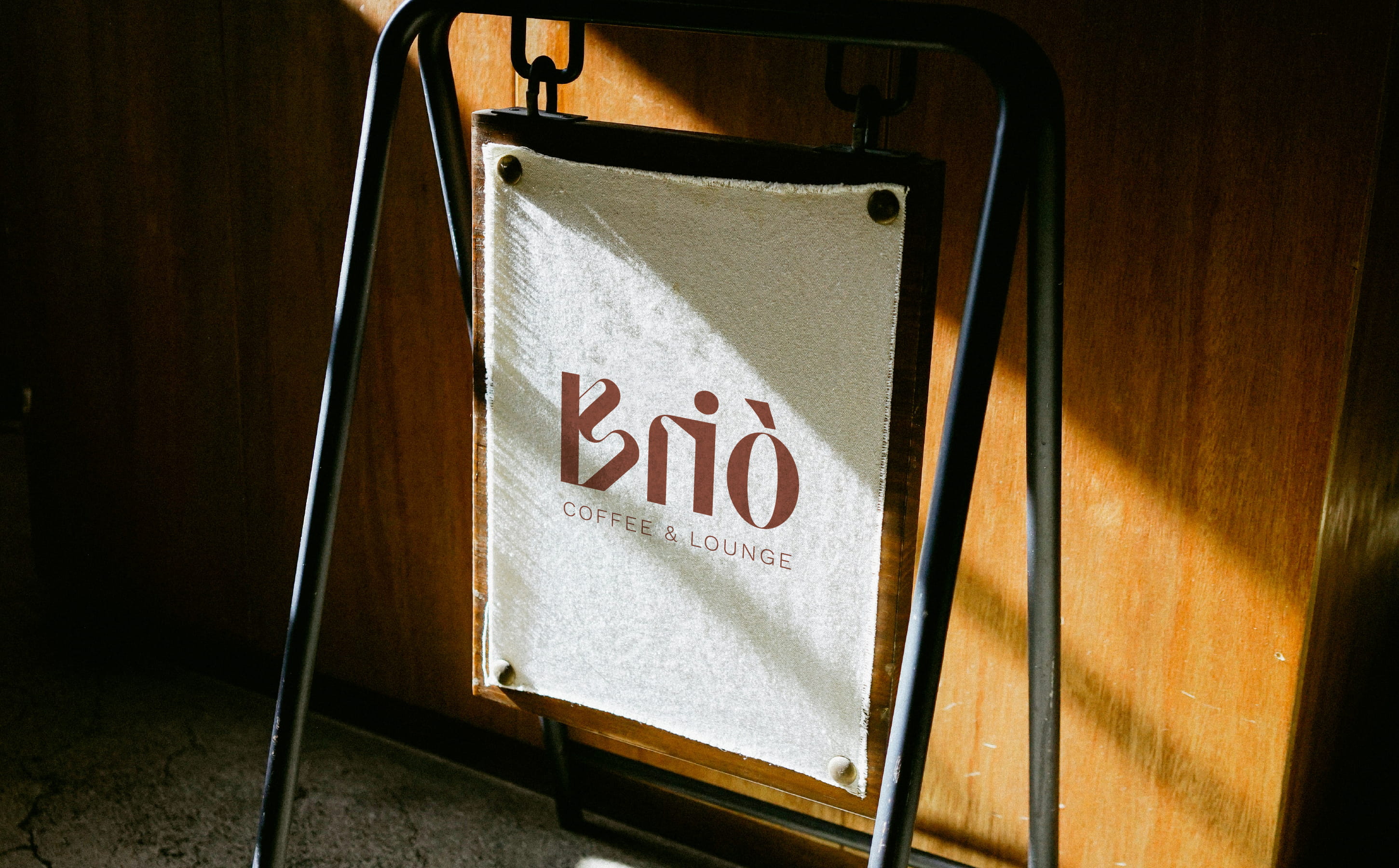
Brio is more than a coffee shop, it’s a space to pause, meet, and take in the quiet around you. The identity was built to reflect that atmosphere. At the center is a custom logotype that leans into contrast. Sharp angles meet circular forms. The accent above the “ò” adds both sound and movement.
Typography choices balance modern structure with warmth. The supporting system plays with layout and spacing to keep the tone calm but intentional. The visual identity stays close to the materials and light of the space, helping Brio feel cohesive across digital and physical touchpoints.
The result is a brand that feels embedded in its environment, soft, clear, and quietly confident.
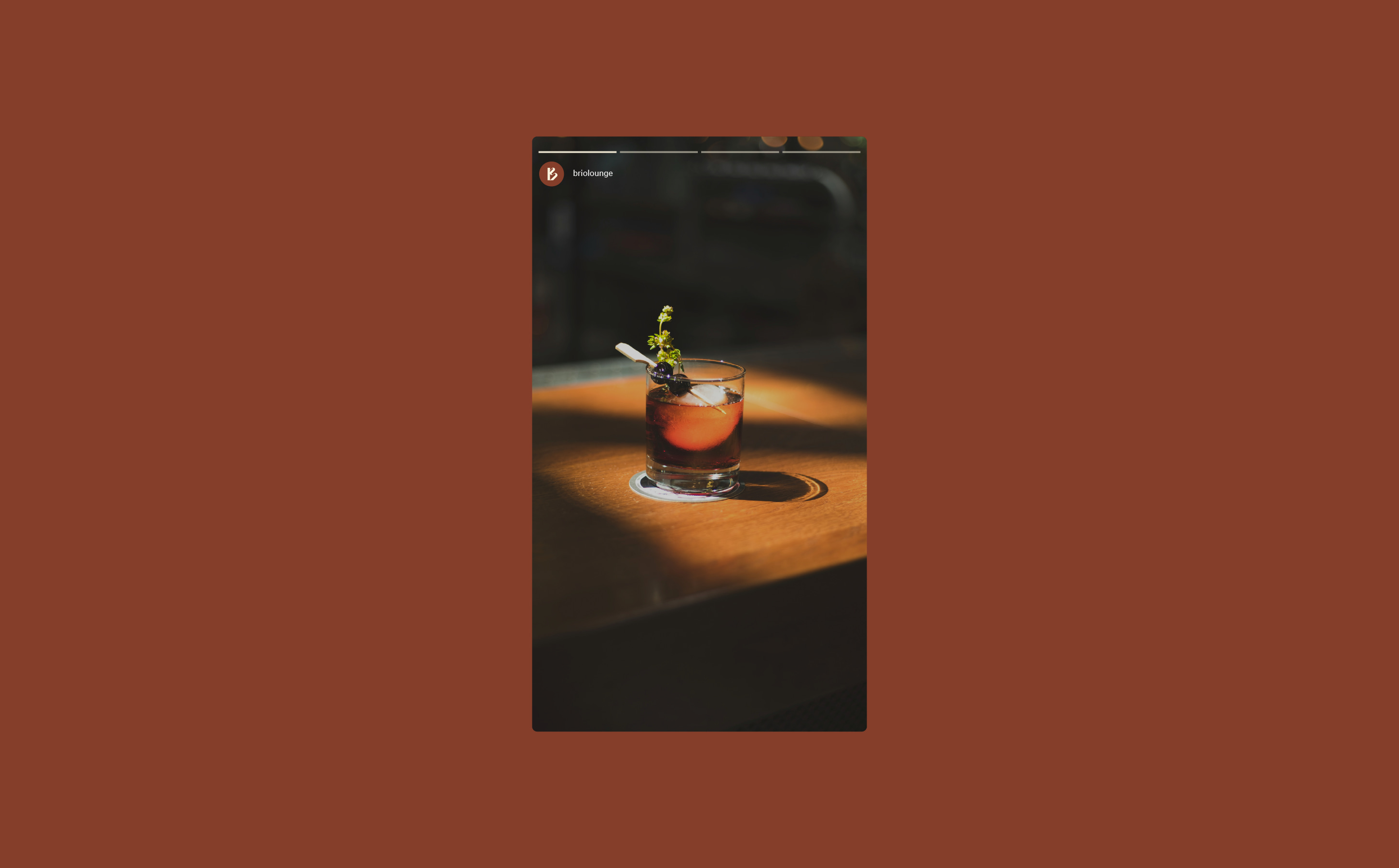
The identity draws from the space itself, warm light, textured walls, and quiet structure. A custom wordmark anchors the system, paired with a palette shaped by material and tone. The result is calm, grounded, and made to sit gently within its surroundings.