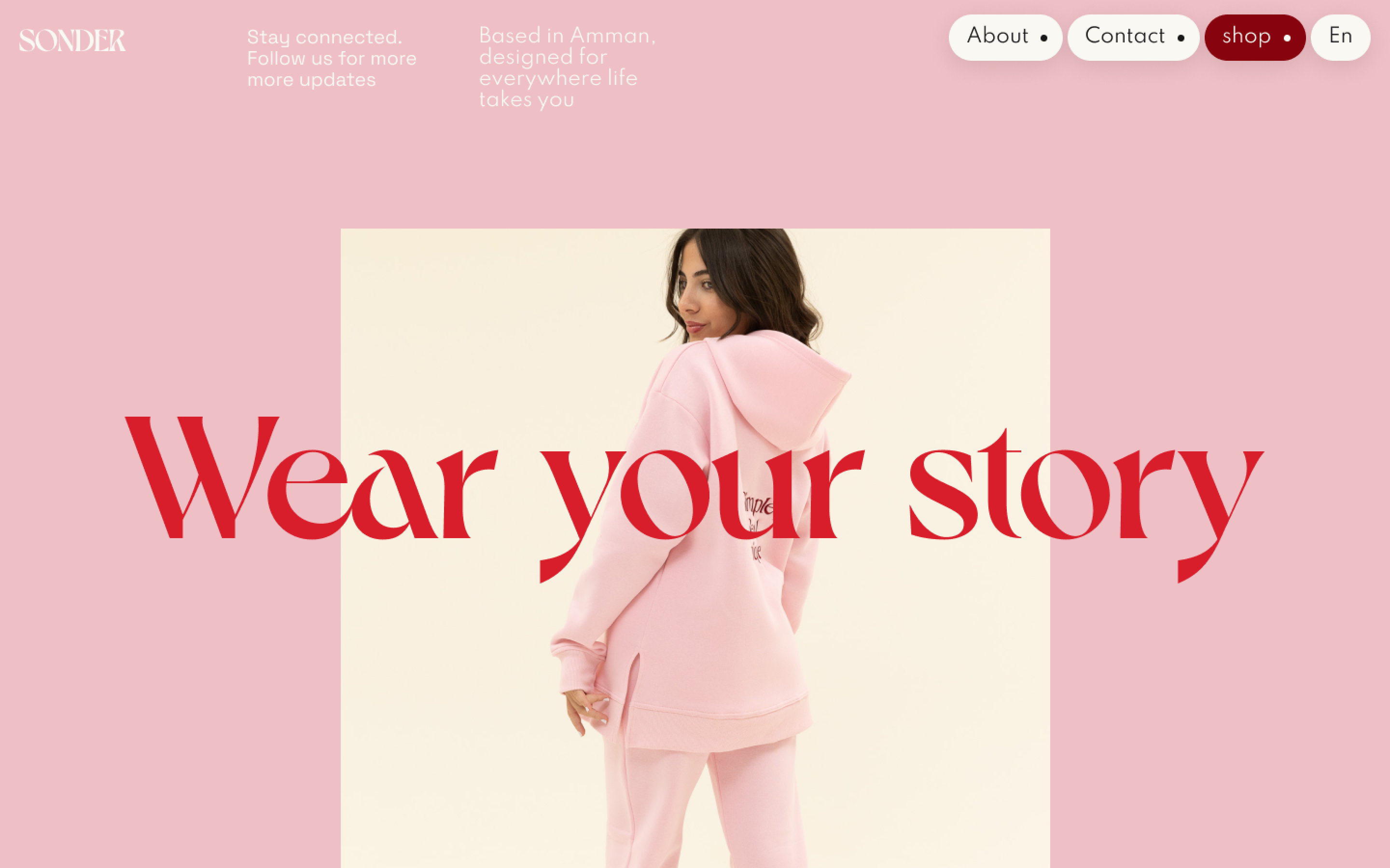
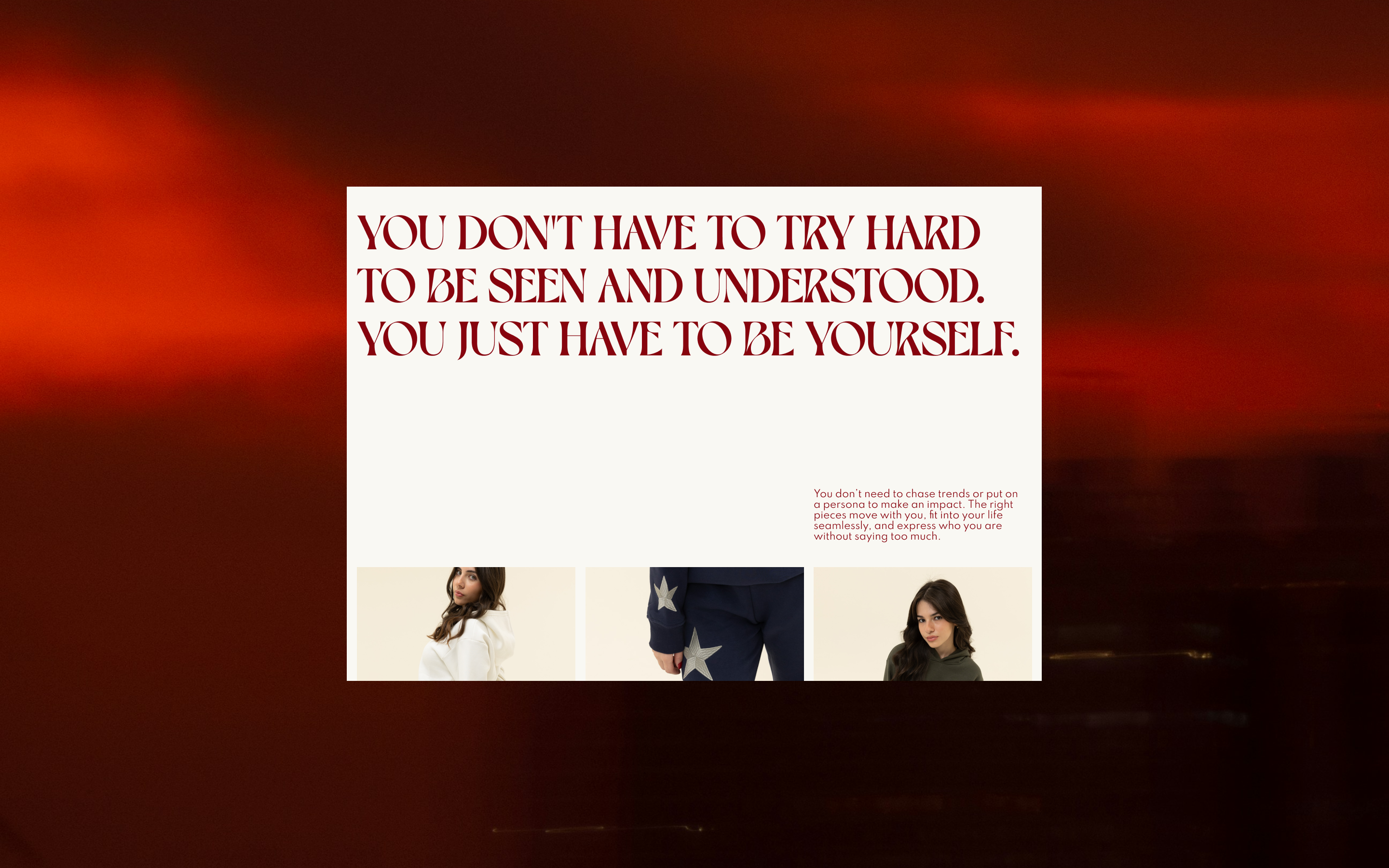
Sonder is built on a single idea: everyone carries a life as rich and real as your own. That’s the story behind the name and the starting point for the brand identity. It’s not about standing out for the sake of it, but about feeling like yourself in what you wear.
The logo plays with contrast and motion. Curved forms and unexpected angles give the wordmark its own rhythm, a quiet standout. Paired with a tone of voice that’s direct, thoughtful, and clear, the system is designed to be expressive without ever being loud.
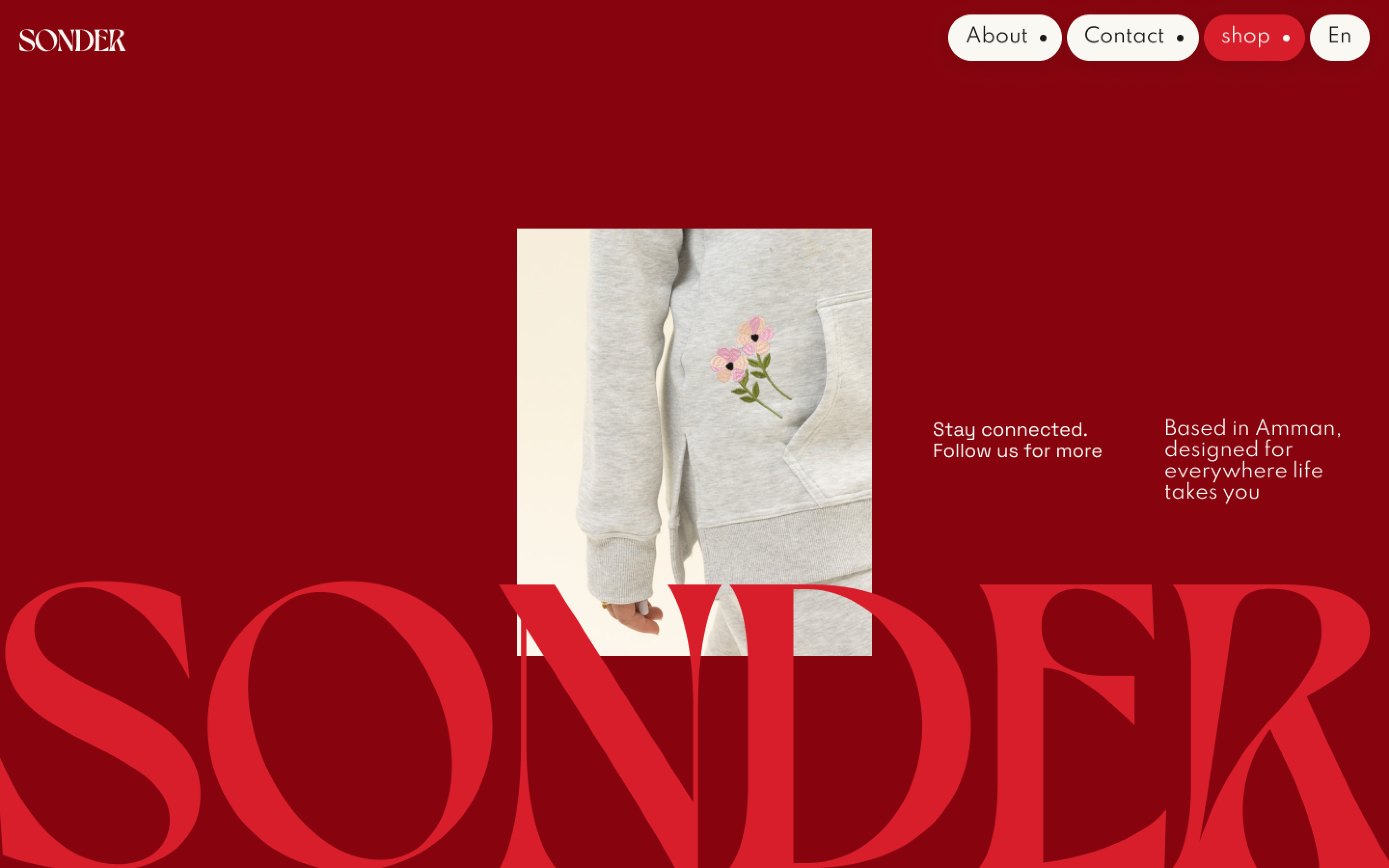
The brand is rooted in Amman but designed for movement across days, moods, and moments. Each piece is made to slip into real life with ease.
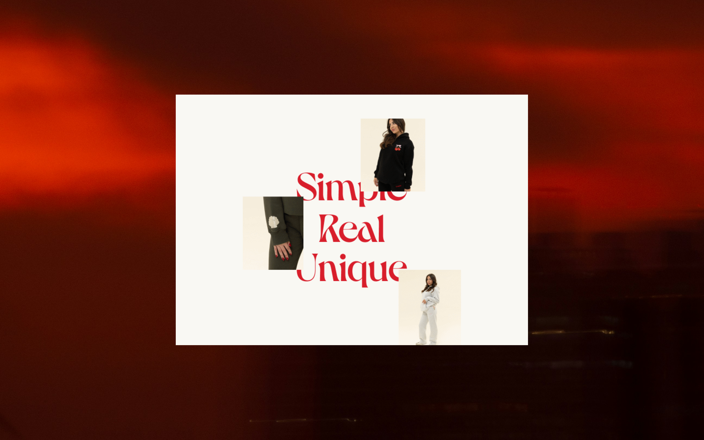
The identity moves between bold and soft, expressive but wearable. The logotype brings contrast and motion, while the color palette and layout stay grounded. Photography and language focus on real people, everyday moments, and a quiet kind of confidence.